A New Look for our Next Evolution

As you may have noticed, CRDF Global looks different! We are excited to unveil this new look on the cusp of our 20th anniversary! Although the process to rebrand CRDF Global was long and tedious, we felt it was worth it in order to represent our bold and modern approach to enabling scientific collaborations around the world. Our new brand is the result of nearly a year’s worth of careful organizational introspection and analysis.
How It BeganThe first step was determining if we were going to outsource the rebranding effort or undertake it ourselves. We decided that we wanted to keep the work in-house. We determined that we wanted a new tagline and a complete revamp of our visuals (logo, symbol, color, typography), and the Marketing & Communications team was up to challenge. However, tackling this important project meant involving lots of other people – both inside and outside the organization – in order to get a 360 degree perspective.
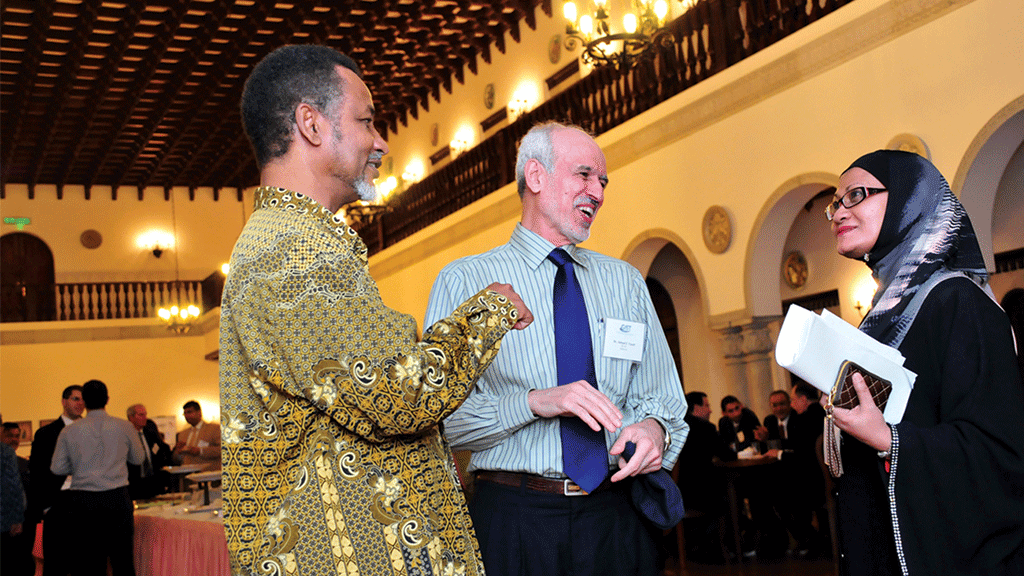
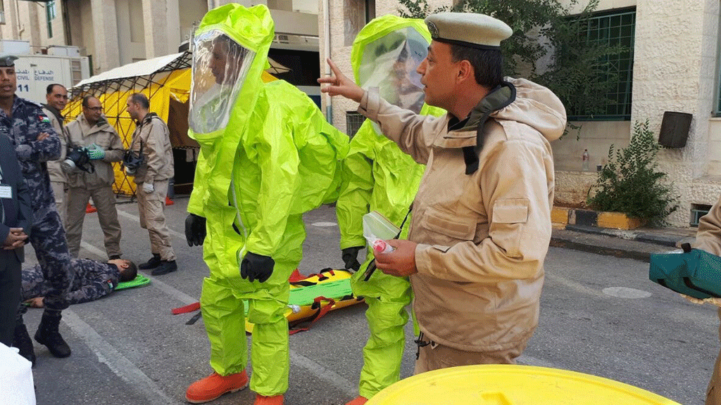
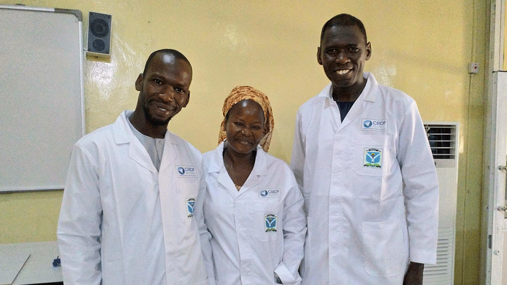
Phase 1 – Our StakeholdersWe started by interviewing several external stakeholders (funders, partners, donors, past board members, etc.) about how they perceived CRDF Global. While much of the feedback that we received was good, we noticed that the responses didn’t accurately represent all the things that CRDF Global does. For many, CRDF Global was solely an entrepreneurship and innovation organization, for others we were simply a grant-making organization – we quickly realized that many of our partners, funders, and donors thought highly of us, they viewed as one-dimensional. The reality is that we do lots of things – as long as it involves international collaborations for scientists and innovators. From hosting study tours to professional skills trainings to managing and facilitating international research collaborations, we are heavily involved in promoting international science and innovation from many angles utilizing many diverse perspectives.
Following the external stakeholders, we moved to our internal stakeholders, including senior management, staff, and our CEO & President, Cathy Campbell (go check her out on twitter @CathyACamp). Meeting with our partners and colleagues really helped us determine how best to bridge the gap between what people thought we did and what we actually do. More importantly, it helped us really nail down why we do it. So what do we do? We create opportunities for scientists and innovators to make the world a better place.
Phase 2 – The TaglineAfter considering all of the input from our staff and external stakeholders, we realized that what makes CRDF Global great are the people with whom we work. We work with scientists and innovators from all over the world who are passionate about collaborating to make the world a better place. They inspire us to do what we do, and from there it was simple to embrace our new tagline: Inspired by People | Driven by Science. We also liked that it can be read with multiple meanings such as: We are inspired by people and driven by science; or, we are inspired by people who are driven by science.
Phase 3 – The LogoFinally, we needed a logo to honor the organization’s role in creating symbiotic partnerships in a synergistic manner. Our new symbol does that and more. We call our new mark – elegant synergy. It symbolizes a “whole” that is greater than the simple sum of its parts, like the collaborations in science and innovation we believe can make the world a better place. Its circular design represents infinite flow and communicates connection, cooperation, and symbiosis. Circles also inherently suggest perpetuity, commitment, and fellowship. The inner spiral design represents creativity, the process of growth, and evolution. Next was the color.
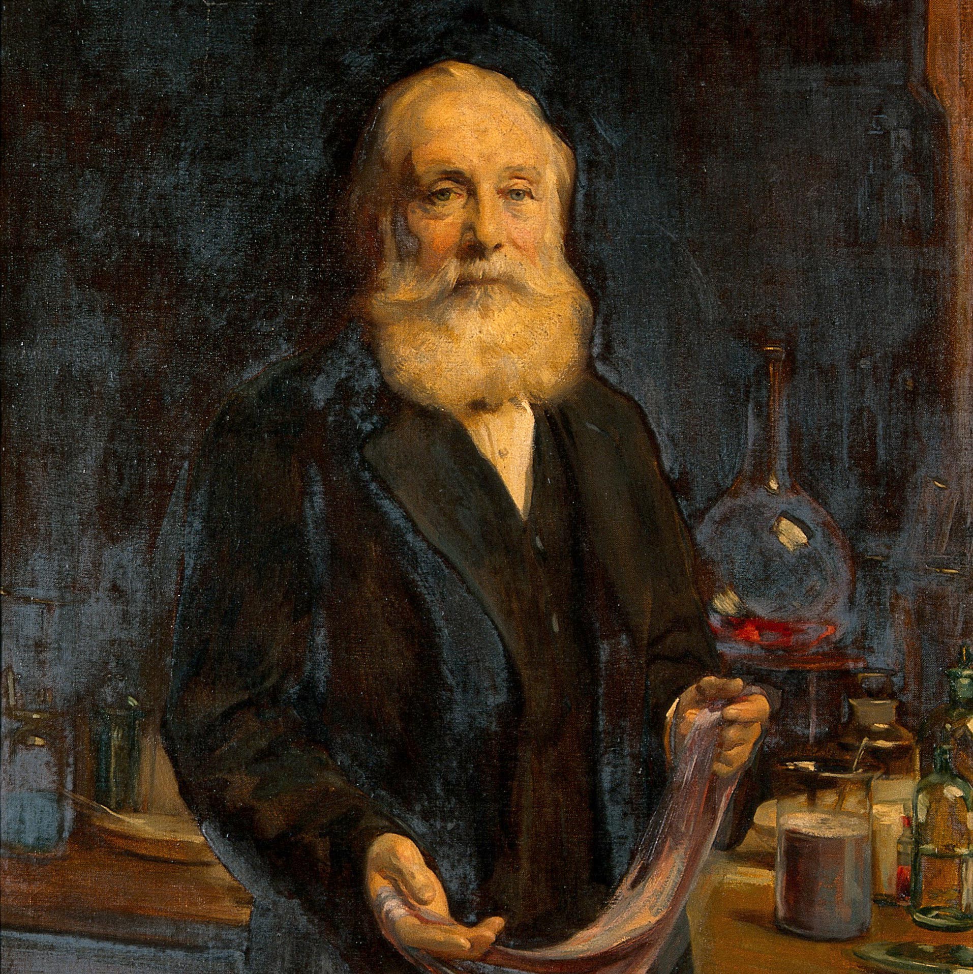
We chose purple because there is a distinct story behind it.Up until the mid-1800s, purple dye was expensive to produce, harmful to the environment, and, thus, reserved only for the upper class. But it was around that time that a British chemist named William Perkin discovered a chemical process to reproduce a long-lasting, synthetic purple dye when trying to create a cure for malaria. The color became widely available and less destructive to the environment.
Nearly one hundred years after Perkin created his dye, a team of German scientists developed sulfonamides, one of the first antibiotics to be systematically used to treat a variety of bacterial infections and other maladies. How did sulfonamides come about? They came about from the study of synthetic coal-tar dyes, which Perkin pioneered. So from Perkin’s early attempts at creating a treatment for malaria to the development of one of the first world’s first classes of antibiotics, our new logo is an example of science (and purple) coming full circle to make the world a better place.
Phase 4 –The WebsiteAs anybody who works regularly with web design knows, things change quickly in the digital realm. Three years ago, we underwent a website redesign that changed the look and feel of the organization. Between our own needs as well as the evolving needs of our grantees, partners, and donors coupled with changes in web design and functionality, prompted us to create a new space for CRDF Global on the web. Look for our new website to launch shortly. It will feature a more user friendly design and get you where you need to go quicker and easier! Plus, it is going to look GREAT.
The FutureScience and innovation keeps us driving forward to help seek solutions to some of the world’s most pressing issues. So long as there are scientists and innovators out there working to address these issues, CRDF Global will be there to help them. We hope that as we launch our new branding, you continue to support our vision of a world made more safe and prosperous through science and international


